A common example of a dark pattern in user interface design is the use of hidden subscription opt-outs. Many websites present a free trial offer but obscure the cancellation button within multiple layers or use misleading language. This design traps users into unwanted recurring payments by making it difficult to unsubscribe. Another frequent dark pattern involves pre-checked boxes during checkout processes. These boxes may automatically opt users into newsletters, additional purchases, or data sharing agreements without clear consent. This practice manipulates user behavior and undermines transparent decision-making in digital transactions.
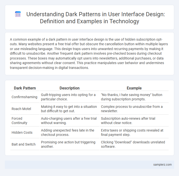
Table of Comparison
| Dark Pattern | Description | Example |
|---|---|---|
| Confirmshaming | Guilt-tripping users into opting for a particular choice. | "No thanks, I hate saving money" button during subscription prompts. |
| Roach Motel | Making it easy to get into a situation but difficult to get out. | Complex process to unsubscribe from a newsletter. |
| Forced Continuity | Auto-charging users after a free trial without warning. | Subscription auto-renews after trial without clear notice. |
| Hidden Costs | Adding unexpected fees late in the checkout process. | Extra taxes or shipping costs revealed at final payment step. |
| Bait and Switch | Promising one action but triggering another. | Clicking "Download" downloads unrelated software. |
Introduction to Dark Patterns in User Interfaces
Dark patterns in user interfaces manipulate user behavior through deceptive design tactics, such as hidden subscription renewals or disguised opt-out options. These manipulative strategies prioritize business goals over user experience, leading to unintended user decisions and potential distrust. Recognizing common examples like disguised ads or confusing navigation helps designers create more ethical and transparent interfaces.
Sneaky Subscription Traps: Forced Continuity
Sneaky subscription traps in user interface design manipulate users into forced continuity by hiding cancellation options and automatically renewing subscriptions without clear consent. These dark patterns exploit ambiguous language and complex navigation to prevent users from easily opting out. E-commerce platforms and streaming services frequently employ forced continuity to increase recurring revenue unethically.
Bait and Switch Techniques in E-Commerce
Bait and switch techniques in e-commerce user interface design involve presenting an attractive offer or product to lure customers, then substituting it with an inferior or more expensive option once users engage. This manipulation exploits users' trust and often leads to frustration or unintended purchases, damaging brand reputation and user loyalty. Common examples include promotional pricing that disappears during checkout or misleading add-to-cart buttons that change the selected product automatically.
Hidden Information: Concealing Key Details
Hidden information in user interface design often manifests as obscured subscription terms or concealed costs during checkout processes, misleading users into unintended commitments. This dark pattern exploits user trust by placing critical data behind ambiguous links or requiring multiple steps to reveal fees, thereby increasing conversion rates at the expense of transparency. Companies utilizing these tactics risk damaging their reputation and invite regulatory scrutiny for deceptive practices.
Trick Questions: Manipulative Form Designs
Trick questions in user interface design often involve manipulative form layouts that confuse users into selecting unintended options, such as double negatives or ambiguous wording in consent checkboxes. These dark patterns exploit user attention by embedding pre-checked boxes or misleading labels that make it difficult to opt out of services. This deceptive design undermines user trust and violates ethical standards in UX design.
Misdirection: Distracting Users from Important Choices
Misdirection in user interface design often involves using visual distractions or misleading layout to divert attention away from critical options, such as opting out of data tracking or subscription cancellations. A common example includes burying the "Decline" button in less noticeable colors or placing it in inconvenient locations while highlighting the "Accept" option with bright colors and larger fonts. This tactic exploits cognitive biases, leading users to make unintended choices that benefit the service provider.
Confirmshaming: Guilt-Driven Prompts
Confirmshaming is a dark pattern in user interface design that guilt-trips users into taking an action by framing opt-out options with emotionally charged language. Phrases like "No, I don't want to save money" manipulate users into feeling guilty for declining offers, increasing conversion rates. This technique exploits psychological pressure to influence user behavior while diminishing genuine consent.
Sneak Into Basket: Unauthorized Item Additions
Sneak Into Basket is a dark pattern in user interface design where unauthorized items are covertly added to a user's shopping cart, manipulating purchases without explicit consent. This deceptive tactic exploits users' trust and often leads to unintended charges, undermining ethical standards in e-commerce platforms. Retailers employing sneak into basket patterns risk damaging customer loyalty and facing regulatory scrutiny.
Roach Motel: Difficult Cancellation Processes
Roach Motel dark patterns in user interface design trap users by making account cancellations or subscription terminations overly complex and time-consuming. Users often encounter multiple confirmation screens, hidden cancellation links, or require contacting customer support to complete the process. This manipulative design exploits user inertia to retain subscriptions or services against their intention, undermining trust and user autonomy.
Privacy Zuckering: Misleading Consent Options
Privacy Zuckering in user interface design involves misleading consent options that trick users into sharing more personal data than they intend to. These dark patterns disguise data-sharing agreements through unclear language, pre-checked boxes, or hidden settings, compromising user privacy. Such deceptive design tactics exploit users' trust and obscure true consent, leading to widespread data misuse.
example of dark pattern in user interface design Infographic