The Lorenz curve is a graphical representation of income distribution within an economy. It plots the cumulative percentage of total income received against the cumulative percentage of income receivers, starting from the poorest to the richest. This curve illustrates the degree of inequality by showing how income is distributed across different population groups. In a perfectly equal society, the Lorenz curve would be a 45-degree line, indicating that each percent of the population earns an equal percent of total income. Real-world economies typically display a bowed Lorenz curve below this line, reflecting income disparities. The greater the bow, the higher the level of income inequality, which can be measured quantitatively using the Gini coefficient derived from the curve.
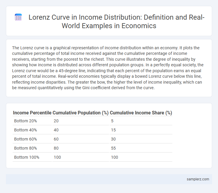
Table of Comparison
| Income Percentile | Cumulative Population (%) | Cumulative Income Share (%) |
|---|---|---|
| Bottom 20% | 20 | 5 |
| Bottom 40% | 40 | 15 |
| Bottom 60% | 60 | 30 |
| Bottom 80% | 80 | 55 |
| Bottom 100% | 100 | 100 |
Introduction to the Lorenz Curve in Income Distribution
The Lorenz curve graphically represents income distribution by plotting the cumulative percentage of total income earned against the cumulative percentage of the population, arranged from the poorest to the richest. An ideal Lorenz curve lies on the diagonal line, indicating perfect equality where each segment of the population earns an equal share of total income. Deviations below this diagonal highlight increasing income inequality, making the Lorenz curve a crucial tool for analyzing and comparing economic disparities within and between societies.
Understanding the Lorenz Curve: Key Concepts
The Lorenz curve visually represents the inequality of income distribution by plotting the cumulative percentage of total income received against the cumulative percentage of recipients, starting with the poorest. A perfectly equal income distribution is depicted as a 45-degree line, while the degree of curvature indicates the level of inequality. The greater the deviation from this line, the higher the income disparity within the population.
Visualizing Income Inequality: The Lorenz Curve Explained
The Lorenz curve visually represents income inequality by plotting the cumulative percentage of total income earned against the cumulative percentage of the population, starting from the poorest to the richest. A perfectly equal income distribution would be depicted as a 45-degree line, known as the line of equality, while the more the Lorenz curve bows away from this line, the greater the income disparity. This graphical tool enables economists to quantify inequality through metrics like the Gini coefficient, which is derived from the area between the Lorenz curve and the line of equality.
Real-Life Example: Lorenz Curve for Country X
The Lorenz curve for Country X reveals that the bottom 20% of the population holds only 5% of the total income, illustrating significant income inequality. In contrast, the top 10% controls nearly 40% of the wealth, highlighting disparities in wealth distribution. These figures reflect challenges in equitable economic growth and inform policies aimed at reducing income gaps.
Interpreting the Lorenz Curve: What the Data Reveals
The Lorenz curve demonstrates income inequality by graphing the cumulative percentage of total income earned against the cumulative percentage of the population, from poorest to richest. When the curve bows significantly below the line of equality, it reveals a larger portion of total income is concentrated among the wealthiest, indicating higher inequality. Analyzing the Lorenz curve helps economists quantify disparity, often complemented by the Gini coefficient to provide a precise measure of income distribution within an economy.
Comparing Lorenz Curves Across Different Countries
Comparing Lorenz curves across different countries reveals variations in income inequality, with steeper curves indicating higher disparity and more bowed curves reflecting greater concentration of wealth. For instance, South Africa's Lorenz curve displays significant inequality compared to the more equitable curve of Sweden, highlighting differing economic structures and social policies. This comparison provides valuable insights into how income is distributed and the effectiveness of redistribution mechanisms internationally.
The Lorenz Curve vs. Perfect Equality: Graphical Differences
The Lorenz curve graphically illustrates income distribution by plotting the cumulative percentage of total income earned against the cumulative percentage of recipients, highlighting deviations from perfect equality. In contrast, the line of perfect equality is a 45-degree diagonal representing an equal share of income across all population segments. The greater the distance between the Lorenz curve and the line of perfect equality, the higher the level of income inequality within an economy.
Applications of the Lorenz Curve in Economic Analysis
The Lorenz curve is a crucial tool in economic analysis for illustrating income inequality within a population by plotting the cumulative percentage of total income against the cumulative percentage of recipients. Its primary application involves measuring income disparities, where the greater the curve bows away from the line of equality, the higher the income inequality. Policymakers and economists use the Lorenz curve to assess the effectiveness of taxation, social welfare programs, and economic policies aimed at wealth redistribution and poverty alleviation.
Limitations of the Lorenz Curve in Measuring Inequality
The Lorenz curve, while valuable for illustrating income distribution, has limitations such as its inability to capture the nuances of wealth inequality and the persistence of poverty within subpopulations. It provides a static snapshot that overlooks temporal changes in income mobility and does not differentiate between sources of income or non-monetary assets. Moreover, the Lorenz curve cannot fully account for factors like tax policies or social transfers that affect real economic inequality.
Policy Implications Inferred from Lorenz Curve Analysis
The Lorenz curve illustrates income inequality by showing the cumulative share of income earned by the population, highlighting disparities that inform targeted fiscal policies. Governments use Lorenz curve analysis to design progressive taxation and social welfare programs aimed at reducing income gaps and promoting economic equity. Policy implications include prioritizing redistribution mechanisms that effectively shift the curve closer to the line of equality, enhancing social cohesion and sustainable growth.
example of Lorenz curve in income distribution Infographic