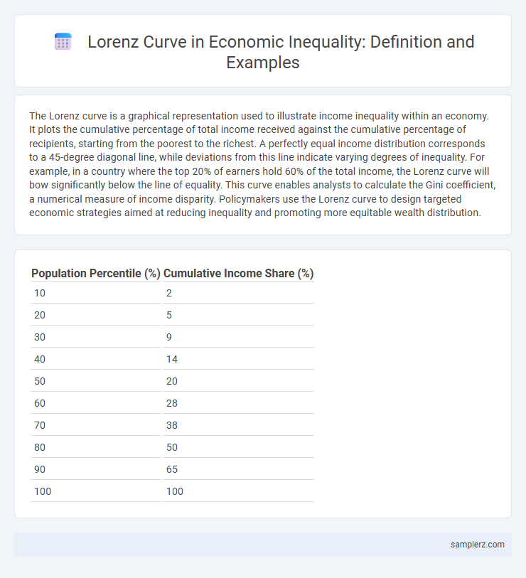
The Lorenz curve is a graphical representation used to illustrate income inequality within an economy. It plots the cumulative percentage of total income received against the cumulative percentage of recipients, starting from the poorest to the richest. A perfectly equal income distribution corresponds to a 45-degree diagonal line, while deviations from this line indicate varying degrees of inequality. For example, in a country where the top 20% of earners hold 60% of the total income, the Lorenz curve will bow significantly below the line of equality. This curve enables analysts to calculate the Gini coefficient, a numerical measure of income disparity. Policymakers use the Lorenz curve to design targeted economic strategies aimed at reducing inequality and promoting more equitable wealth distribution.
Table of Comparison
| Population Percentile (%) | Cumulative Income Share (%) |
|---|---|
| 10 | 2 |
| 20 | 5 |
| 30 | 9 |
| 40 | 14 |
| 50 | 20 |
| 60 | 28 |
| 70 | 38 |
| 80 | 50 |
| 90 | 65 |
| 100 | 100 |
Introduction to the Lorenz Curve in Economic Inequality
The Lorenz curve graphically represents income distribution within an economy, illustrating the degree of inequality by plotting cumulative income against cumulative population percentage. A perfectly equal society displays a 45-degree line, while deviations from this line indicate varying levels of income concentration. Economists use the Lorenz curve alongside the Gini coefficient to quantify economic inequality and analyze disparities in wealth distribution.
Visualizing Income Distribution with the Lorenz Curve
The Lorenz curve visually represents income distribution by plotting the cumulative percentage of total income against the cumulative percentage of households. It highlights income inequality through the deviation between the curve and the line of perfect equality. Economists use the area between these two lines to calculate the Gini coefficient, a key measure of inequality.
Lorenz Curve Example: National Income Disparity
The Lorenz curve illustrates national income disparity by plotting the cumulative percentage of total income earned against the cumulative percentage of households, highlighting income inequality within a country. For example, in the United States, the bottom 40% of households might earn only about 12% of total income, while the top 20% could earn more than 50%, demonstrating a significant income gap. This graphical representation helps economists measure economic inequality and assess the effectiveness of wealth redistribution policies.
Case Study: Lorenz Curve for Wealth Inequality
The Lorenz Curve for wealth inequality in the United States reveals a pronounced disparity, where the richest 10% hold nearly 70% of total wealth, demonstrating a steep curve far from the line of equality. Data from the Federal Reserve's Survey of Consumer Finances highlights that the bottom 50% of households possess less than 2% of the nation's wealth, illustrating the concentration of assets within the upper echelons. This case study exemplifies how the Lorenz Curve quantifies wealth distribution, providing a clear visual tool to assess economic inequality.
Analyzing Poverty Levels Using the Lorenz Curve
The Lorenz curve graphically represents income distribution within an economy, illustrating the proportion of total income earned by cumulative percentages of the population. By analyzing the curve's deviation from the line of equality, economists can assess the degree of income inequality and identify poverty levels. Precise measurement through the Gini coefficient derived from the Lorenz curve facilitates targeted policy interventions aimed at poverty alleviation.
Lorenz Curve Application: Gender Wage Gap
The Lorenz Curve effectively illustrates the gender wage gap by plotting the cumulative share of wages earned by women versus men within the workforce. This graphical representation highlights disparities in income distribution, where a larger bow in the curve indicates greater inequality between genders. Studies using Lorenz Curves consistently reveal that women earn a disproportionately smaller share of total wages, underscoring persistent wage inequality in various economies.
Regional Inequality Illustrated by the Lorenz Curve
The Lorenz curve illustrates regional inequality by showing the cumulative distribution of income or wealth across different geographic areas, highlighting disparities between richer and poorer regions. For example, plotting cumulative population percentages of various regions against their cumulative income reveals significant gaps where wealth is concentrated in a few urban hubs, leaving rural or underserved areas with minimal shares. Such visualization aids policymakers in identifying uneven resource allocation and designing targeted interventions to reduce regional economic disparities.
Comparing Countries: Lorenz Curve and the Gini Coefficient
The Lorenz curve illustrates income distribution disparities by plotting the cumulative percentage of total income received against the cumulative percentage of recipients, revealing inequality levels across countries. For example, South Africa exhibits a highly skewed Lorenz curve, corresponding with its Gini coefficient of approximately 0.63, indicating significant income inequality. In contrast, countries like Sweden demonstrate a more linear Lorenz curve and a lower Gini coefficient near 0.28, reflecting more equitable income distribution.
Interpreting Socioeconomic Data through Lorenz Curves
The Lorenz curve graphically represents income distribution within a population, illustrating the degree of economic inequality by plotting the cumulative percentage of total income against the cumulative percentage of recipients. A perfectly equal income distribution corresponds to a 45-degree line, while deviations from this line indicate varying levels of inequality. Economists utilize the Lorenz curve to interpret socioeconomic data, enabling policymakers to identify disparities and design targeted interventions to promote more equitable wealth distribution.
Limitations and Insights from Lorenz Curve Examples
The Lorenz curve illustrates income inequality by plotting the cumulative percentage of total income earned against the cumulative percentage of the population, yet it cannot capture wealth distribution or temporal changes in inequality. Limitations include its inability to reflect the depth of deprivation among the poorest or the impact of non-monetary assets, leading to oversimplified insights. Despite these constraints, the Lorenz curve remains crucial for comparing inequality across countries and guiding policy decisions aimed at reducing income disparities.
example of Lorenz curve in inequality Infographic