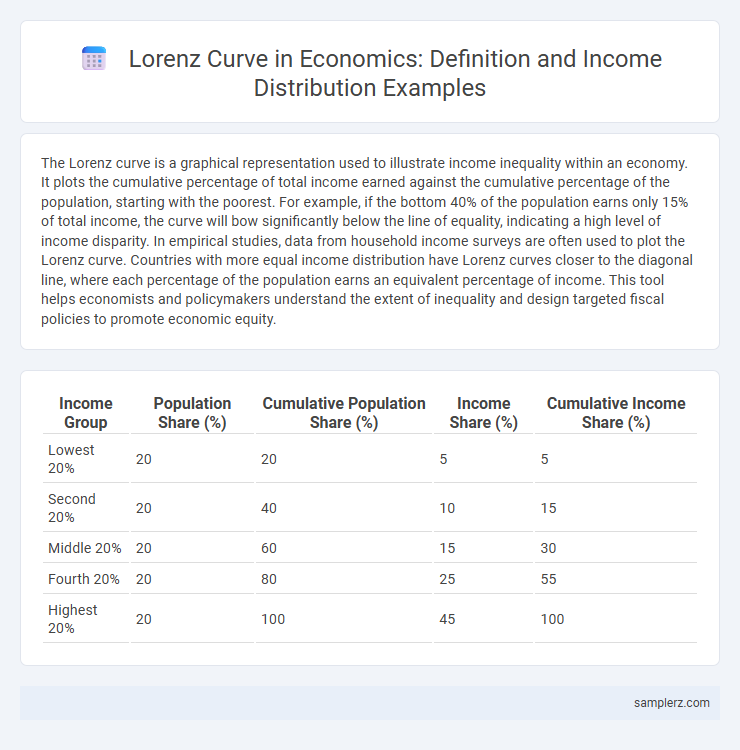
The Lorenz curve is a graphical representation used to illustrate income inequality within an economy. It plots the cumulative percentage of total income earned against the cumulative percentage of the population, starting with the poorest. For example, if the bottom 40% of the population earns only 15% of total income, the curve will bow significantly below the line of equality, indicating a high level of income disparity. In empirical studies, data from household income surveys are often used to plot the Lorenz curve. Countries with more equal income distribution have Lorenz curves closer to the diagonal line, where each percentage of the population earns an equivalent percentage of income. This tool helps economists and policymakers understand the extent of inequality and design targeted fiscal policies to promote economic equity.
Table of Comparison
| Income Group | Population Share (%) | Cumulative Population Share (%) | Income Share (%) | Cumulative Income Share (%) |
|---|---|---|---|---|
| Lowest 20% | 20 | 20 | 5 | 5 |
| Second 20% | 20 | 40 | 10 | 15 |
| Middle 20% | 20 | 60 | 15 | 30 |
| Fourth 20% | 20 | 80 | 25 | 55 |
| Highest 20% | 20 | 100 | 45 | 100 |
Understanding the Lorenz Curve in Income Distribution
The Lorenz curve illustrates income distribution by plotting the cumulative percentage of total income earned against the cumulative percentage of households, highlighting disparities in wealth allocation. A perfectly equal income distribution aligns with the diagonal line, while deviations indicate inequality levels. Understanding the curve assists economists in measuring income inequality and informing policy decisions targeting equitable growth.
Key Features of the Lorenz Curve Explained
The Lorenz Curve illustrates income distribution by plotting the cumulative percentage of total income earned against the cumulative percentage of the population, arranged from poorest to richest. Key features include the curve's shape relative to the line of equality, where the greater the bowing away from this line, the higher the level of income inequality. The area between the Lorenz Curve and the line of equality is quantitatively measured by the Gini coefficient, reflecting the degree of income disparity within an economy.
Real-World Examples of the Lorenz Curve in Practice
The Lorenz curve effectively illustrates income inequality by plotting cumulative income shares against cumulative population percentages, as seen in the United States where the top 10% holds nearly 70% of total wealth. In Brazil, the curve highlights stark disparities, with the richest 20% earning over 75% of the income, demonstrating significant economic imbalance. South Africa's Lorenz curve also reveals severe inequality, reflecting a Gini coefficient exceeding 0.6, one of the highest globally, emphasizing the persistent wealth gap.
Lorenz Curve: Visualizing Income Inequality
The Lorenz Curve graphically represents income distribution by plotting the cumulative percentage of total income earned against the cumulative percentage of the population, starting from the poorest to the richest. A perfectly equal income distribution results in a linear 45-degree line, while the degree of curvature below this line indicates the extent of income inequality. Economists use this curve to quantify disparities, with larger gaps signifying higher inequality within an economy.
Case Study: Lorenz Curve Application in the United States
The Lorenz Curve in the United States illustrates income inequality by plotting the cumulative percentage of total income received against the cumulative percentage of households, revealing significant disparities in wealth distribution. In recent decades, data from the U.S. Census Bureau shows the top 20% of households earn approximately 52% of total income, while the bottom 20% earn less than 3%. This case study highlights how the Lorenz Curve effectively quantifies economic inequality, aiding policymakers in assessing and addressing income distribution challenges.
Comparing Lorenz Curves Across Different Countries
Comparing Lorenz curves across different countries reveals significant disparities in income distribution, where a steeper curve indicates greater income inequality, such as in Brazil compared to the flatter curve of Sweden, reflecting more equitable wealth distribution. Data from the World Bank show that the Gini coefficients align closely with Lorenz curve shapes, with countries like South Africa exhibiting a more pronounced bend, signaling high disparity. This comparison highlights how economic policies and social structures influence income equality globally, providing a visual and quantitative measure of socioeconomic divides.
Interpreting Lorenz Curve Data for Policymaking
The Lorenz Curve graphically represents income distribution, highlighting the degree of inequality within an economy. Policymakers use Lorenz Curve data to identify income disparities and measure the effectiveness of redistributive policies by comparing the curve to the line of equality. Interpreting shifts in the Lorenz Curve helps design targeted interventions to reduce poverty and promote economic equity.
Step-by-Step Construction of a Lorenz Curve Example
To construct a Lorenz curve for income distribution, start by ranking the population from lowest to highest income and calculating the cumulative share of income and population. Plot cumulative population percentages on the x-axis against cumulative income percentages on the y-axis to visualize inequality. This curve lies below the line of equality, where the greater the bow, the higher the income disparity within the economy.
Lorenz Curve and the Calculation of the Gini Coefficient
The Lorenz Curve graphically represents income distribution by plotting the cumulative percentage of total income earned against the cumulative percentage of households, illustrating inequality within an economy. Calculation of the Gini Coefficient involves measuring the area between the Lorenz Curve and the line of perfect equality, with values ranging from 0 (perfect equality) to 1 (maximum inequality). This coefficient serves as a crucial indicator for policymakers and economists to analyze income disparities and assess the effectiveness of redistributive policies.
Implications of Lorenz Curve Findings on Economic Policy
The Lorenz Curve reveals significant income inequality by illustrating the cumulative share of income earned by different population segments, often showing that the bottom 40% of earners receive less than 20% of total income. These findings guide economic policy through the implementation of progressive taxation and targeted social welfare programs designed to redistribute wealth and reduce income disparity. Policymakers use Lorenz Curve data to evaluate the effectiveness of income redistribution mechanisms and to adjust fiscal policies aimed at promoting economic equity and social stability.
example of lorenz curve in income Infographic