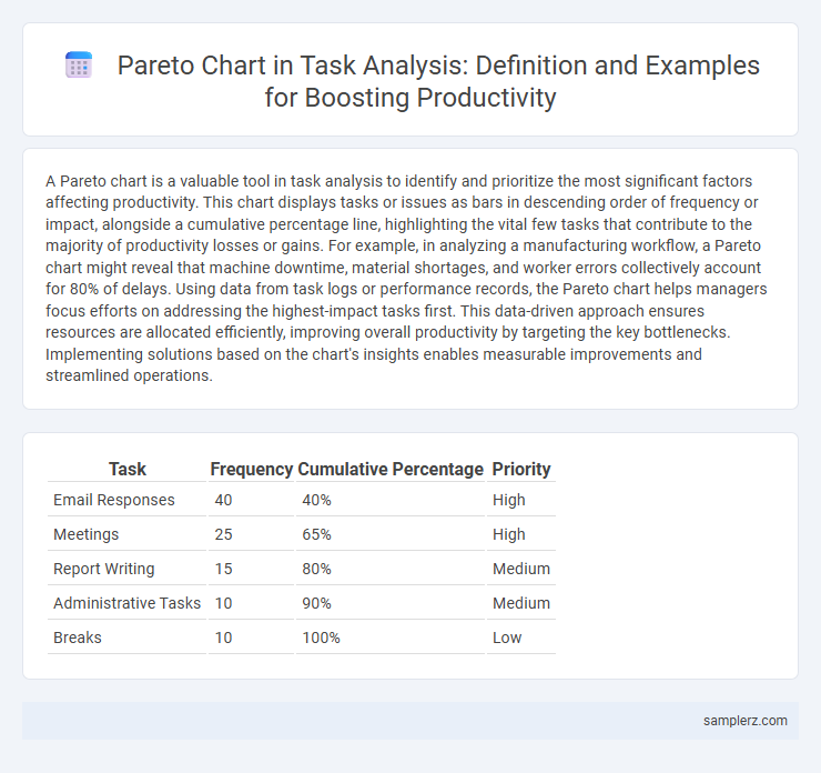
A Pareto chart is a valuable tool in task analysis to identify and prioritize the most significant factors affecting productivity. This chart displays tasks or issues as bars in descending order of frequency or impact, alongside a cumulative percentage line, highlighting the vital few tasks that contribute to the majority of productivity losses or gains. For example, in analyzing a manufacturing workflow, a Pareto chart might reveal that machine downtime, material shortages, and worker errors collectively account for 80% of delays. Using data from task logs or performance records, the Pareto chart helps managers focus efforts on addressing the highest-impact tasks first. This data-driven approach ensures resources are allocated efficiently, improving overall productivity by targeting the key bottlenecks. Implementing solutions based on the chart's insights enables measurable improvements and streamlined operations.
Table of Comparison
| Task | Frequency | Cumulative Percentage | Priority |
|---|---|---|---|
| Email Responses | 40 | 40% | High |
| Meetings | 25 | 65% | High |
| Report Writing | 15 | 80% | Medium |
| Administrative Tasks | 10 | 90% | Medium |
| Breaks | 10 | 100% | Low |
Understanding the Pareto Chart in Task Analysis
A Pareto chart in task analysis highlights the most critical tasks contributing to the majority of delays or errors by displaying tasks in descending order of frequency or impact. This tool enables identification of the vital few tasks causing 80% of productivity issues, allowing targeted improvements. Using Pareto charts helps prioritize efforts on high-impact tasks, optimizing workflow and resource allocation effectively.
Key Elements of a Pareto Chart
A Pareto chart in task analysis highlights vital factors by displaying tasks on the x-axis and their frequency or impact on the y-axis, with bars ordered from highest to lowest. The cumulative line graph emphasizes the "vital few" tasks contributing to most delays or errors, enabling targeted productivity improvements. Key elements include the categorization of tasks, frequency data, cumulative percentage line, and clear visual distinction between major and minor issues.
Identifying Major Tasks with Pareto Analysis
Pareto chart analysis highlights the critical 20% of tasks responsible for 80% of productivity bottlenecks, enabling targeted improvements in workflow efficiency. By visually ranking tasks such as email management, report generation, and meeting facilitation, this method identifies priority areas for time allocation and process optimization. Focusing on major task contributors allows teams to maximize productivity gains with minimal effort using data-driven decision-making.
Step-by-Step Guide to Creating a Pareto Chart for Productivity
To create a Pareto chart for productivity, first identify and list all tasks impacting workflow efficiency, then record the frequency or impact of each task over a specific period. Sort the tasks in descending order based on their contribution to delays or errors, calculate the cumulative percentage, and plot bars representing each task alongside a cumulative line graph. This visual prioritization helps focus improvement efforts on the vital few tasks that cause the majority of productivity loss.
Real-world Example: Task Analysis Using Pareto Chart
A Pareto chart in task analysis identifies the most time-consuming activities, revealing that 80% of delays often stem from 20% of tasks. For example, a software development team used a Pareto chart to pinpoint debugging and code review as major bottlenecks, allowing them to prioritize improvements. This data-driven approach streamlined workflow, significantly enhancing overall productivity by targeting high-impact tasks.
Interpreting Pareto Chart Results in Task Management
Interpreting Pareto chart results in task management reveals that 80% of productivity issues often stem from 20% of specific tasks or bottlenecks, enabling focused resource allocation. For instance, identifying that a small subset of repetitive administrative tasks consumes the majority of time helps prioritize process improvements effectively. Clear visualization of defect types or delay causes assists managers in targeting critical areas, thereby optimizing workflow and enhancing overall productivity.
Common Productivity Tasks Highlighted by Pareto Principle
A Pareto chart in task analysis identifies that 20% of tasks, such as responding to emails and attending meetings, account for 80% of time spent, highlighting key areas for productivity improvement. By focusing on these critical tasks, individuals and teams can streamline workflows, reduce time wastage, and enhance overall efficiency. This data-driven approach enables prioritization of high-impact activities, maximizing output with minimal resource expenditure.
Prioritizing Tasks Based on Pareto Chart Insights
A Pareto chart highlights the vital few tasks contributing to the majority of delays, helping prioritize efforts on the 20% of tasks causing 80% of inefficiencies. By focusing on high-impact tasks identified in the chart, teams can allocate resources effectively and accelerate project completion. This data-driven prioritization optimizes productivity by reducing time spent on less critical activities.
Benefits of Using Pareto Chart for Task Analysis
A Pareto chart in task analysis highlights the most critical tasks causing the majority of delays or errors, enabling focused improvements. By visualizing task frequencies or durations, it helps prioritize efforts on high-impact issues, enhancing overall productivity. This targeted approach reduces wasted time and resources, leading to more efficient workflows and better task management.
Best Practices for Applying Pareto Chart in Productivity Tracking
Implementing Pareto charts in productivity tracking involves identifying the vital few tasks that contribute to the majority of delays or inefficiencies, enabling focused improvements. Best practices include regularly updating data to reflect current performance, prioritizing tasks with the highest impact on productivity, and integrating the chart with time-tracking tools for precise analysis. Consistently applying these methods enhances decision-making accuracy and drives measurable productivity gains by addressing the most significant obstacles.

example of pareto chart in task analysis Infographic
 samplerz.com