A common example of a dark pattern in marketing interfaces is the use of hidden subscription fees. This tactic involves displaying a low initial price for a product or service while concealing mandatory additional charges until the checkout phase. Users often feel misled when they discover the extra costs, which increases the likelihood of unintended purchases. Another prevalent dark pattern is the use of disguised ads that mimic regular content. These advertisements are designed to blend seamlessly with the interface, making it difficult for users to distinguish between genuine content and promotional material. This manipulation can lead to higher click-through rates but compromises user trust and can result in negative brand perception over time.
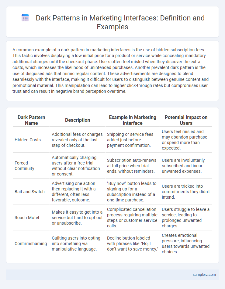
Table of Comparison
| Dark Pattern Name | Description | Example in Marketing Interface | Potential Impact on Users |
|---|---|---|---|
| Hidden Costs | Additional fees or charges revealed only at the last step of checkout. | Shipping or service fees added just before payment confirmation. | Users feel misled and may abandon purchase or spend more than expected. |
| Forced Continuity | Automatically charging users after a free trial without clear notification or consent. | Subscription auto-renews at full price when trial ends, without reminders. | Users are involuntarily subscribed and incur unwanted expenses. |
| Bait and Switch | Advertising one action then replacing it with a different, often less favorable, outcome. | "Buy now" button leads to signing up for a subscription instead of a one-time purchase. | Users are tricked into commitments they didn't intend. |
| Roach Motel | Makes it easy to get into a service but hard to opt out or unsubscribe. | Complicated cancellation process requiring multiple steps or customer service calls. | Users struggle to leave a service, leading to prolonged unwanted charges. |
| Confirmshaming | Guilting users into opting into something via manipulative language. | Decline button labeled with phrases like "No, I don't want to save money." | Creates emotional pressure, influencing users towards unwanted choices. |
Understanding Dark Patterns in User Interfaces
Dark patterns in user interfaces manipulate user behavior through deceptive design choices, such as hidden fees, disguised ads, or confusing opt-out options. These tactics exploit cognitive biases, leading users to make unintended purchases or share more personal data than intended. Recognizing these patterns helps marketers design transparent, user-friendly experiences that build trust and improve long-term customer loyalty.
Common Types of Dark Patterns in Marketing
Common types of dark patterns in marketing interfaces include hidden costs, where additional fees only appear at the final checkout stage, leading to unexpected charges. Sneak into basket tactics automatically add products to the shopping cart without explicit user consent, inflating purchase totals. Roach motel designs make it easy to subscribe or sign up but deliberately difficult to cancel or unsubscribe, trapping users in ongoing billing cycles.
Bait and Switch: A Deceptive User Journey
Bait and Switch in marketing interfaces manipulates users by presenting an appealing offer that changes once engaged, such as advertising a free trial but requiring credit card information with hidden future charges. This deceptive user journey exploits trust, leading to increased drop-off rates yet higher unintended purchases. Dark patterns like this undermine user experience and can damage brand reputation through negative reviews and regulatory scrutiny.
Hidden Costs: Unveiling the Final Price
Hidden costs in marketing interfaces exemplify dark patterns by obscuring additional fees until the final stages of a purchase, leading to unexpected price increases. This deceptive tactic manipulates consumer trust and distorts transparent pricing, often resulting in higher cart abandonment rates. Clear disclosure of all costs upfront enhances user experience and fosters brand credibility.
Forced Continuity: Difficult Subscription Cancellations
Forced continuity in marketing interfaces occurs when companies design subscription cancellation processes to be intentionally complicated, requiring multiple steps or hidden options to deter users. This dark pattern often involves obscure cancellation links, mandatory phone calls, or prolonged waiting periods that frustrate consumers and increase revenue retention. Such tactics exploit user inertia and erode trust, negatively impacting brand reputation and customer satisfaction.
Sneak Into Basket: Automatic Add-Ons in Checkouts
Sneak Into Basket dark patterns manipulate users by automatically adding extra products or services during checkout without explicit consent, increasing the overall purchase value deceptively. This tactic exploits user distraction and urgency, often pre-ticking boxes for insurance, warranties, or subscriptions that are difficult to deselect. Businesses using automatic add-ons risk damaging trust and may face regulatory scrutiny for misleading consumer practices in digital marketing.
Roach Motel: Trapping Users in Unwanted Services
Roach Motel dark patterns in marketing interfaces trap users by making it easy to sign up for services but extremely difficult to cancel subscriptions, leading to unwanted charges and frustration. Companies often hide cancellation options deep within menus or require multiple steps and contacting customer service to exit. This deceptive design exploits user inertia and increases churn while damaging brand trust.
Confirmshaming: Guilt-Tripping Users into Action
Confirmshaming manipulates users by framing opt-out choices with guilt-inducing language like "No, I don't want to save money," coercing clicks through emotional pressure. This dark pattern exploits psychological triggers to increase conversions but damages trust and user experience. Marketers should prioritize transparent, respectful design to maintain brand integrity and foster long-term customer loyalty.
Misleading Scarcity and Urgency Tactics
Misleading scarcity and urgency tactics manipulate users by falsely signaling limited availability or time constraints to pressure immediate decisions, often seen in e-commerce checkout pages displaying fake countdown timers or exaggerated stock levels. These dark patterns exploit psychological triggers like fear of missing out (FOMO) to boost conversion rates, undermining trust and ethical marketing standards. Brands employing such deceptive tactics risk damaging customer loyalty and face increasing regulatory scrutiny.
Negative Option Billing: Opt-Out Defaults and User Consent
Negative option billing is a dark pattern where users are automatically enrolled in subscriptions or services unless they actively opt out, often hiding the opt-out option in obscure interface locations. This tactic undermines informed user consent by presenting pre-checked boxes or default selections that lead to unexpected charges. Such deceptive design manipulates user behavior, increasing involuntary payments and damaging brand trust in digital marketing environments.
example of dark pattern in interface Infographic